Power BI: One Live View of a Multi-Site Clinic Network
A governed Power BI model unifying scheduling, EHR, billing and finance across four systems into two role-based dashboards refreshed every morning.
 Power BI
- Power BI
Power BI Case Study · Healthcare
Multi-site clinic network: scheduling, EHR, billing & finance unified · 6-week engagement
Reports that used to take days across sites now land by 6am, and we act on them the same morning.
Operations Director
The network ran on four disconnected systems: scheduling, the EHR, billing/claims and finance. Leadership could never see patient flow, provider utilisation and revenue-cycle health in the same place, and each site’s monthly report was rebuilt by hand. I consolidated all four into one governed Power BI model behind two role-based dashboards, refreshed automatically every morning, turning days of manual reporting into a screen the team reads with their coffee.
What Was Leaking
- Siloed systems: Scheduling, EHR, billing and finance never lined up, so no-shows, utilisation and collections couldn’t be seen together.
- Manual per-site reporting: Every site’s pack was rebuilt by hand (weeks behind by the time it landed, and easy to get wrong).
- Invisible revenue leakage: Denials, AR aging and slow collections weren’t tracked in one place, so cash slipped through unnoticed.
Dashboard One: Patient Flow & Utilisation
Appointments vs utilisation, department mix, top sites, a day-by-hour utilisation heat map and capacity gauge.
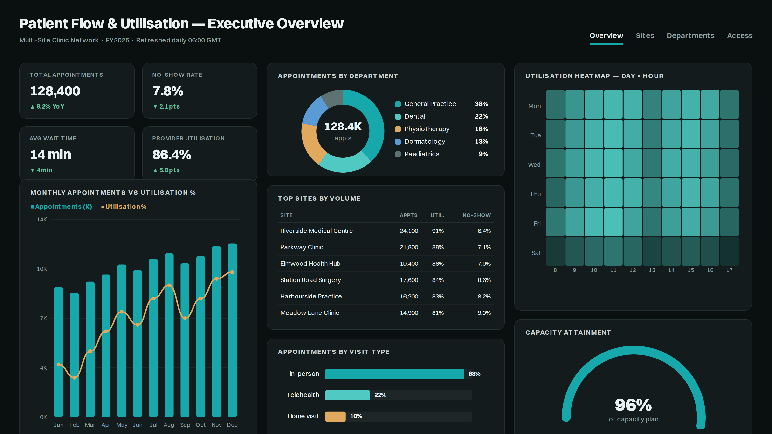
- Utilisation heatmap: Spots under-used clinic slots by day and hour at a glance.
- Sites & departments: Ranks volume and no-shows together, site by site.
- Volume vs utilisation: Pairs appointment growth with the utilisation trend.
- Capacity gauge: Tracks attainment against the plan, currently 96%.
Dashboard Two: Revenue Cycle & Claims
Billed vs collection rate, a claims funnel, AR aging buckets and net revenue by payer.
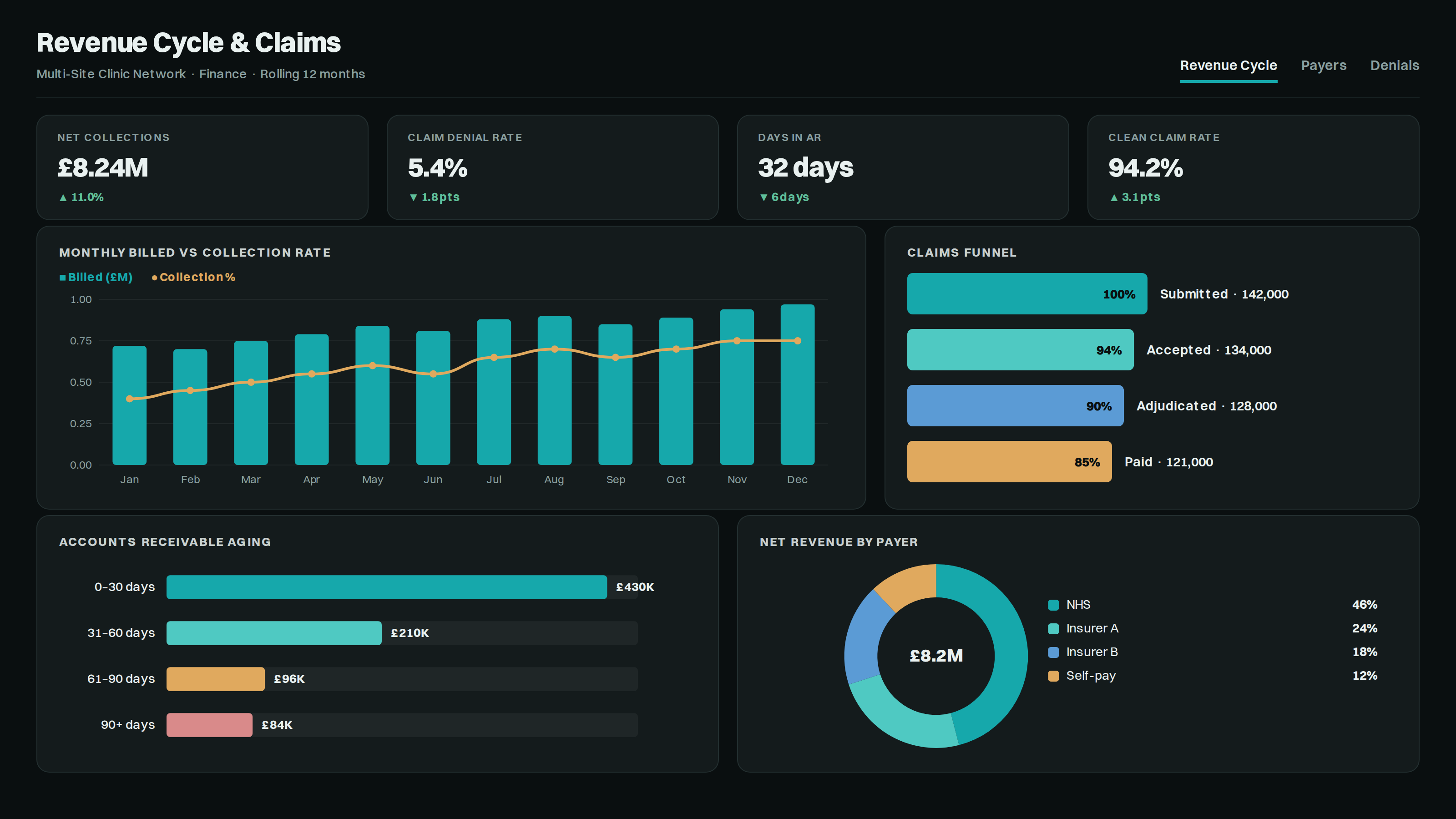
- Claims funnel: Shows where submissions fall out before they’re paid.
- AR aging: Flags the £84K stuck in 90+ days for chase-up.
- Billed vs collected: Tracks the collection rate month over month.
- Payer mix: Splits net revenue across NHS, insurers and self-pay.
How It’s Built
| Stage | What We Built | Tools |
|---|---|---|
| Sources | 4 systems: Scheduling · EHR · Billing · GL | REST / API / file connectors |
| Clean | Key standardisation | Power Query |
| Model | Star schema, shared date table, DAX | Power BI model + DAX |
| Secure | RLS by site, per-site access | RLS roles |
| Deliver | 06:00 refresh via gateway & service | Power BI Service + gateway |
The Impact
After six weeks
With utilisation and no-shows visible by site and hour, the network reallocated clinic slots and tightened reminders, lifting utilisation five points while trimming no-shows, and replacing days of manual work with an automatic 6am refresh reconciled to the ledger.